HEMA (Amsterdam, Netherlands)
2010 – 2016
Packaging design for a variety of product ranges
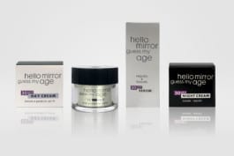
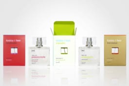
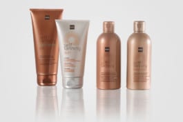
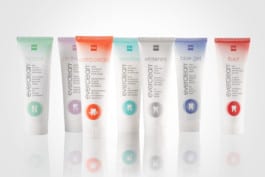
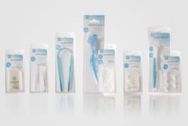
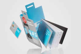
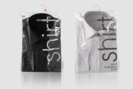
Once HEMA had introduced a new brand identity – including a new logo and a typeface based on Futura Maxi – the iconic Dutch variety store chain asked us to design the instore packaging communication for a number of its product ranges. We designed the printed information on the packaging for products in the Cosmetics, Body care, Mouth care, Fashion, Bicycle, Automotive and Stationery departments, among others.
In designing the packaging, our challenge was to achieve a simple, brand-oriented and brand-supporting typography that would be communicative in a straightforward and visually attractive way. The name of the product served as an eyecatcher on the front, along with its USPs in three languages. In some of the product groups we added an element of illustration to further support the communication on the product identity.
see also:
HEMA: Organize

HEMA (Amsterdam, Netherlands)
2010 – 2016
Packaging design for a variety of product ranges
Once HEMA had introduced a new brand identity – including a new logo and a typeface based on Futura Maxi – the iconic Dutch variety store chain asked us to design the instore packaging communication for a number of its product ranges. We designed the printed information on the packaging for products in the Cosmetics, Body care, Mouth care, Fashion, Bicycle, Automotive and Stationery departments, among others.
In designing the packaging, our challenge was to achieve a simple, brand-oriented and brand-supporting typography that would be communicative in a straightforward and visually attractive way. The name of the product served as an eyecatcher on the front, along with its USPs in three languages. In some of the product groups we added an element of illustration to further support the communication on the product identity.


see also:
HEMA: Organize
