Haus der Kulturen der Welt (Berlin, Germany)
Christian Philipp Müller
‘The spirit of the Haus: 20 years of the Haus der Kulturen der Welt, 1989–2009’
2009
Exhibition architecture, flags and brochure
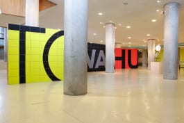
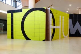
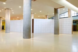
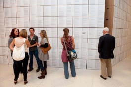
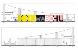
Translations of the Hebrew word Tohuwabohu, which denotes the condition of the world before the creation of light, vary from Luther's ‘formless and void’ to the more colloquial ‘giant mess’. Swiss conceptual artist Christian Philipp Müller used this word for both an installation and a performance series that focused on the 20-year history of the Haus der Kulturen der Welt, a museum housed in a former Congress Hall in West Berlin. With the installation, Müller sought to create order out of chaos. It consisted of a wall built of 432 cardboard boxes zigzagging in five sections through the open foyer of the museum.
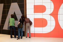
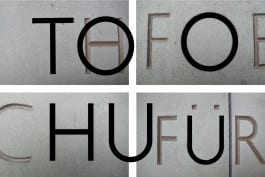
Christian Philipp Müller asked us to do the graphic design for the concept and realisation of the installation for this event. Having found a fascinating typeface used in a dedication carved on the stone wall of the former Congress Hall, we used that for the word Tohuwabohu, which we stretched across the front of the zigzagging sections of the wall, where each of the cardboard boxes was covered by a A3-size sheet of coloured paper. On the rear of the same wall we added a chronological list of all the concerts, lectures, expositions and other events that had been organised in Haus der Kulturen der Welt over the previous 20 years. Mounted in the angles of the zigzagging wall, an audio system broadcast stories told by older and younger museum employees that visitors could listen to as they walked by.
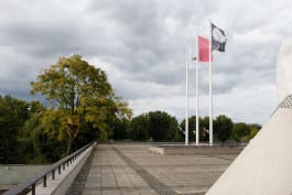
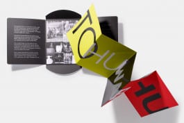
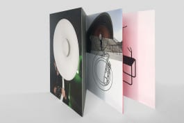
The special-edition brochure that we designed for the exhibition was printed in beautiful Pantone colours with an UV spot. Folded accordion-like to reflect the zigzag motif of the installation, the brochure itself was wrapped in a folder, the inside of which carried references to the building’s history. Finally, we also designed the three large flags (7m x 4m) that flew atop the immense masts outside the former Congress Hall.
Photography: Thomas Eugster
Printer: robstolk® (Amsterdam)
see also:
Christian Philipp Müller: ‘Portrait of the museum as a chair: Typology of all 54 chairs in use at the National Museum of Art, Osaka’
Haus der Kunst: Christian Philipp Müller ‘Histories in conflict: Haus der Kunst and the ideological uses of art, 1937–1955’
Kunstmuseum Basel – Museum für Gegenwartskunst: ‘Christian Philipp Müller’
Tangente St.Pölten: Christian Philipp Müller ‘Ein Bad für Florian’

Haus der Kulturen der Welt (Berlin, Germany)
Christian Philipp Müller
‘The spirit of the Haus: 20 years of the Haus der Kulturen der Welt, 1989–2009’
2009
Exhibition architecture, flags and brochure
Translations of the Hebrew word Tohuwabohu, which denotes the condition of the world before the creation of light, vary from Luther's ‘formless and void’ to the more colloquial ‘giant mess’. Swiss conceptual artist Christian Philipp Müller used this word for both an installation and a performance series that focused on the 20-year history of the Haus der Kulturen der Welt, a museum housed in a former Congress Hall in West Berlin. With the installation, Müller sought to create order out of chaos. It consisted of a wall built of 432 cardboard boxes zigzagging in five sections through the open foyer of the museum.
Christian Philipp Müller asked us to do the graphic design for the concept and realisation of the installation for this event. Having found a fascinating typeface used in a dedication carved on the stone wall of the former Congress Hall, we used that for the word Tohuwabohu, which we stretched across the front of the zigzagging sections of the wall, where each of the cardboard boxes was covered by a A3-size sheet of coloured paper. On the rear of the same wall we added a chronological list of all the concerts, lectures, expositions and other events that had been organised in Haus der Kulturen der Welt over the previous 20 years. Mounted in the angles of the zigzagging wall, an audio system broadcast stories told by older and younger museum employees that visitors could listen to as they walked by.
The special-edition brochure that we designed for the exhibition was printed in beautiful Pantone colours with an UV spot. Folded accordion-like to reflect the zigzag motif of the installation, the brochure itself was wrapped in a folder, the inside of which carried references to the building’s history. Finally, we also designed the three large flags (7m x 4m) that flew atop the immense masts outside the former Congress Hall.
Photography: Thomas Eugster
Printer: robstolk® (Amsterdam)


see also:
Christian Philipp Müller: ‘Portrait of the museum as a chair: Typology of all 54 chairs in use at the National Museum of Art, Osaka’
Haus der Kunst: Christian Philipp Müller ‘Histories in conflict: Haus der Kunst and the ideological uses of art, 1937–1955’
Kunstmuseum Basel – Museum für Gegenwartskunst: ‘Christian Philipp Müller’
Tangente St.Pölten: Christian Philipp Müller ‘Ein Bad für Florian’
